Smart Interfaces
Project diary of Jasper Kamphuis 2022
For this project, I've worked together with Nora and Mark to create an app that can, in an intelligent way, help you with your social media addiction with the focus on Instagram. We all worked together and used our strengths to create this app. I added the part mainly on the research's conceptual and visual aspect since I have an in Arts and Design.
Conceptual research
Visual research
Brainstorming and ideation
First Iteration
Second Iteration
For my conceptual research, I mainly focused on the media's perception. My goals are to find out what you'll find by just googling the terms addiction combined with social media to see the results most people will read and discover what we as designers can do with this information and combine it with academic research.
Doing my visual research, I mainly looked at existing projects within the realm of anti-addiction or anti social media globally. The reason for doing this research is to understand if people have already thought about an app that can help you with Addiction and how they try to help people with their addiction.
One app/website I found was Feedless. They called themselves the non-addictive social network since they researched what features make an app addictive, and for their product, they didn't add those features but only the good parts about how it helps people socialise. They also wrote almost a manifesto on their homepage with all the harmful elements they didn't add, as you see here above.
This next app: Die With Me, a chat app you can only use when you have less than 5% battery. The exciting part of this is that it creates connections with new people based on a situation where you can talk about or with people in a common condition, which is an exciting take on connecting people.
The next app, GoGray not an app you download but a change you can make in your settings app. And maybe you already guessed it; it's turning your screen to grayscale. When your screen is in grayscale, the content you see is less attractive and doesn't scream anymore for your attention, which helps you use your phone less.
The last exciting app, or rather an extension, is also called Feedless, and it's a browser extension for the Facebook website. The extension changed up the Facebook experience to make it less addictive. So it just wholly hides the addictive features and lets people enjoy the social network. This take is interesting since it changes an individual's experience yet still enables them to participate in the same app.
My research started by finding what is already done to fight social media addiction. But the first findings were a bit disappointing. Most apps are glorified timers that limit only the time you can access an app within a specific time.
One of the most exciting articles is that even the Prime Minister of the Uk is considering ways to treat social media as something serious.
Even the European Parliament published in 2019 an article about the growing threat of internet addiction. The rapidly growing internet use in general and how it makes people hooked. This makes the EU an exciting partner since they have a lot of power and leverage about the ruling in Europe, and even globally, they can change rules with the GDPR. That's why we choose the EU as our partner in helping treat and spread knowledge about internet addiction.
This last article summarised the statistics on social media usage globally but led to exciting research papers, mainly on which demographic we should focus on. The primary demographic of social media addicts where surprised are young, single females. Later we did some questionnaires, which besides being single, confirmed this research.
We mainly brainstormed on what to do with social media addiction since it's a broad topic with the first brainstorms. Eventually, we concluded to make an app that informs and helps people like a personal coach on your phone.
The first iteration of our name was Addiction with the @ sign. But this was too vague and hard to understand. So after that, we changed the app name to Rehapp since most it's an addiction you want to get rid of.
I researched and found out that green would be the perfect fit for the color. Green promotes restfulness and calm, improving efficiency and focus.
Within the first iteration, I mainly focused on developing a system for onboarding into the app to develop how users interact with the app on Instagram.
The most logical was just a notification popping up on your screen which is fine but not that interesting. A more exciting way of interaction is using a messenger-like pop-up bubble that will appear on your screen. With research on DBCI, we found that it is vital to give people alternatives to change their behaviour, so I added a fun option about birdwatching. The last idea I came up with was to create a mini-console where you can do everything related to the app. However, engaging this is not that realistic or viable to develop in practice.
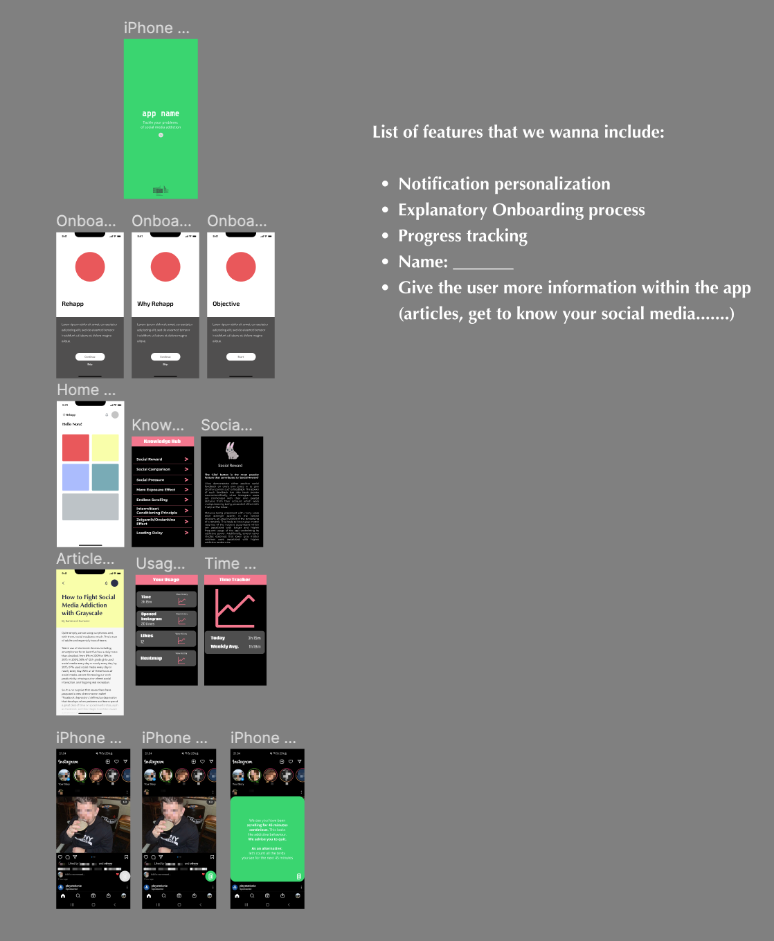
After all, designing how we visioned the app to look like we combined the most exciting or best-executed versions of a feature into our first design of an app. The app we created had an onboarding that explains the app, a homepage with tiles for the different components, including a knowledge hub that goes into dept in social media features and why they are addictive, Articles related, and an in-depth view in your usage. For interacting directly with Instagram, we choose the pop-up bubble as the best and most effective way to intervene with the user.
We presented this first design to multiple people with a background in data and design to give feedback on our app from a UI perspective. Next, we conducted interviews about people's overall experience with Instagram and their knowledge about social media addiction.
Summarising this, we concluded that we need some extra features seen in the list of features next to the design on the right.
First design
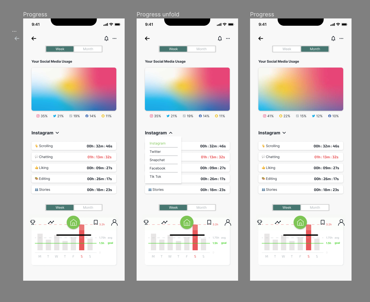
For the second iteration, I tried to find alternative ways of showing data for the second iteration.
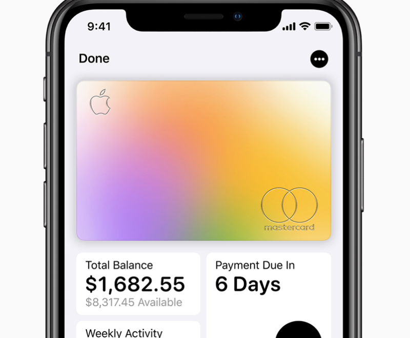
Because we want to track the behaviour, we have a lot of data we want to communicate with them to help them understand themselves and their addiction. But Just showing only graphs makes it more like a financial app than a personal app. So to combat this, I found an example of Apple cards and how they show their expanses by creating a hue that makes it more human to look at numbers.
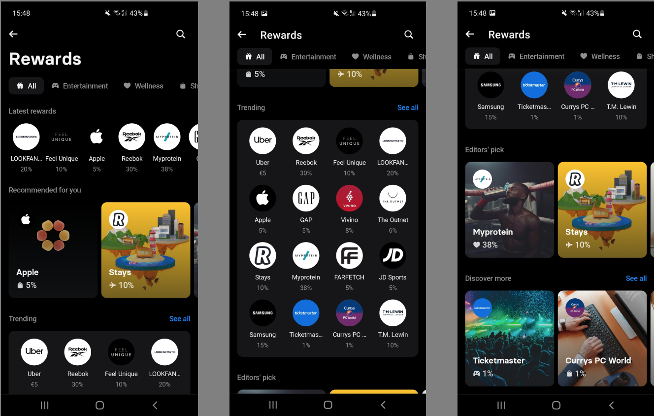
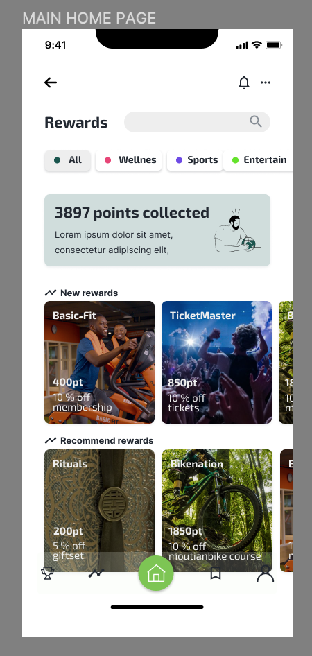
Another feature I worked on was the rewards system. The rewards system creates a reason for users to use the app and benefit from it. But instead of just random rewards, we choose to make the rewards thing that will help people interact more with each other in the real world of giving discounts on products that help you improve your health, like a gym membership. Mark found an excellent example of his banking app that does the same, giving you points when you spend money in this case. The app also has a straightforward and easy-to-use design, so I adapted it for our app.
Next to that, I improved the pop-up bubble.
Second design
After the first and second iterations, we presented our new design to people we previously didn't talk to. Among the interviewees were also a couple of UX designers who helped us finalise our app to make the experience more streamlined from a user's perspective using the app for the first time.
After that, it was just finalising the app. We work a lot together for the last part to finish the app and change minor details within the flow and UI. The most noticeable part I did was finalising the pop-up with a logo and a design more like the app's home page and creating the interaction on setting up your goals while boarding the app.
Conclusion
The project was interesting to work on both from a subject and an operational group perspective. The issue is so interesting because it's relevant in this day and age to think about how to go further in the future and where social media will fit with all the problems we face. Also, the group dynamic was interesting to work in. This is because the three of us have different backgrounds and ways of doing things but complimented each other to work effectively to a good end product.
Finalising